Handpan Dojo.He asked for a few visuals
The challenge
David Kuckhermann came to us for a few visuals. A Grammy-nominated musician, asking for something to help him reach a new audience and share the art of playing handpan.
The problem underneath that was larger than a set of graphics. The handpan is a remarkable instrument that most people cannot name, so the brand had to make a stranger curious before they ever heard it played.
And there was a second thing, harder to design for. David's teaching works because of who he is: the energy and the joy he brings to it. In a room, that transmits by itself. On a screen it disappears, and what is left is a competent stranger demonstrating a technique. Students were watching from the outside rather than feeling part of anything.
A brand that only looked professional would have made that worse.
The move
We went further than the brief, because the brief would not have worked.
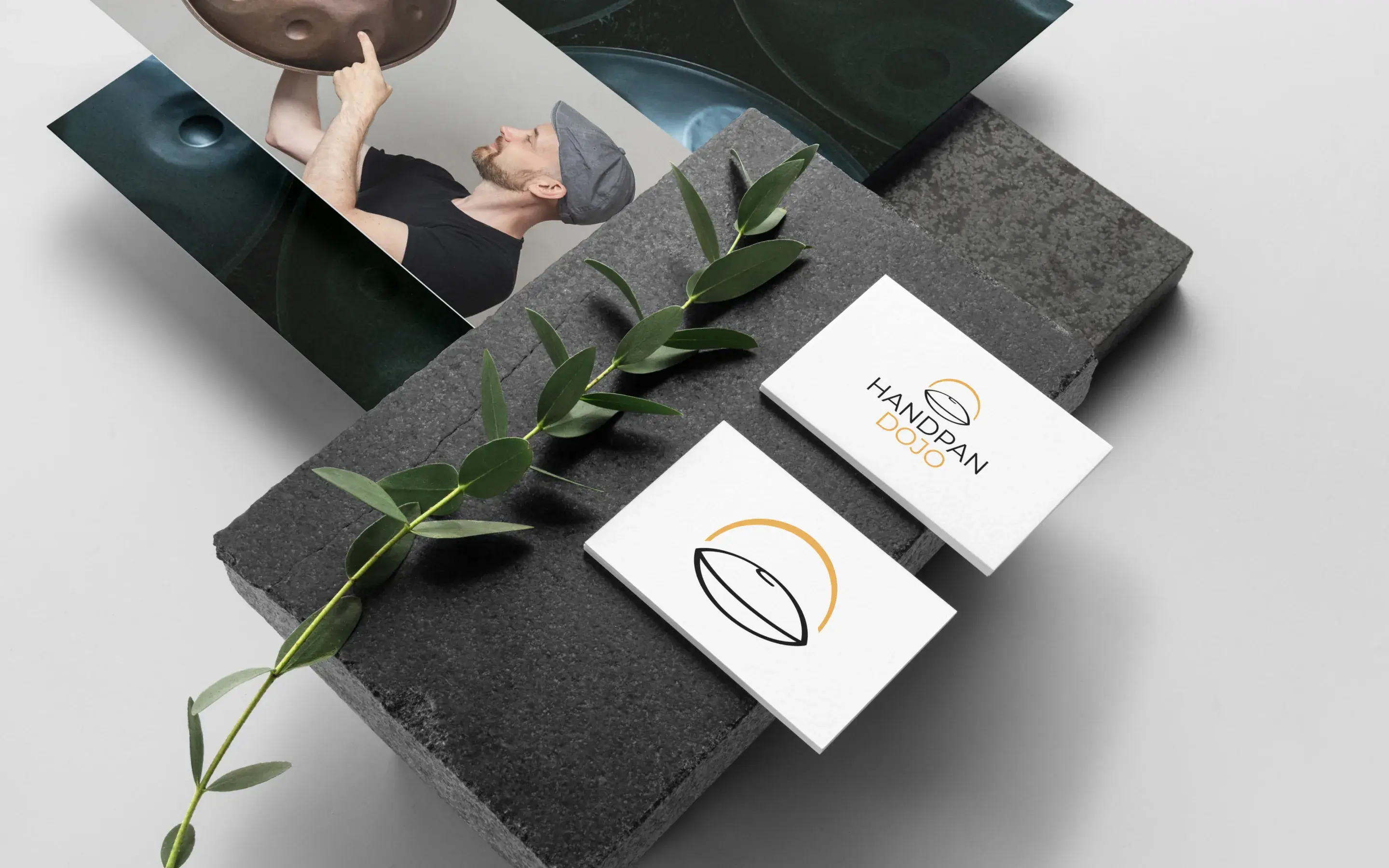
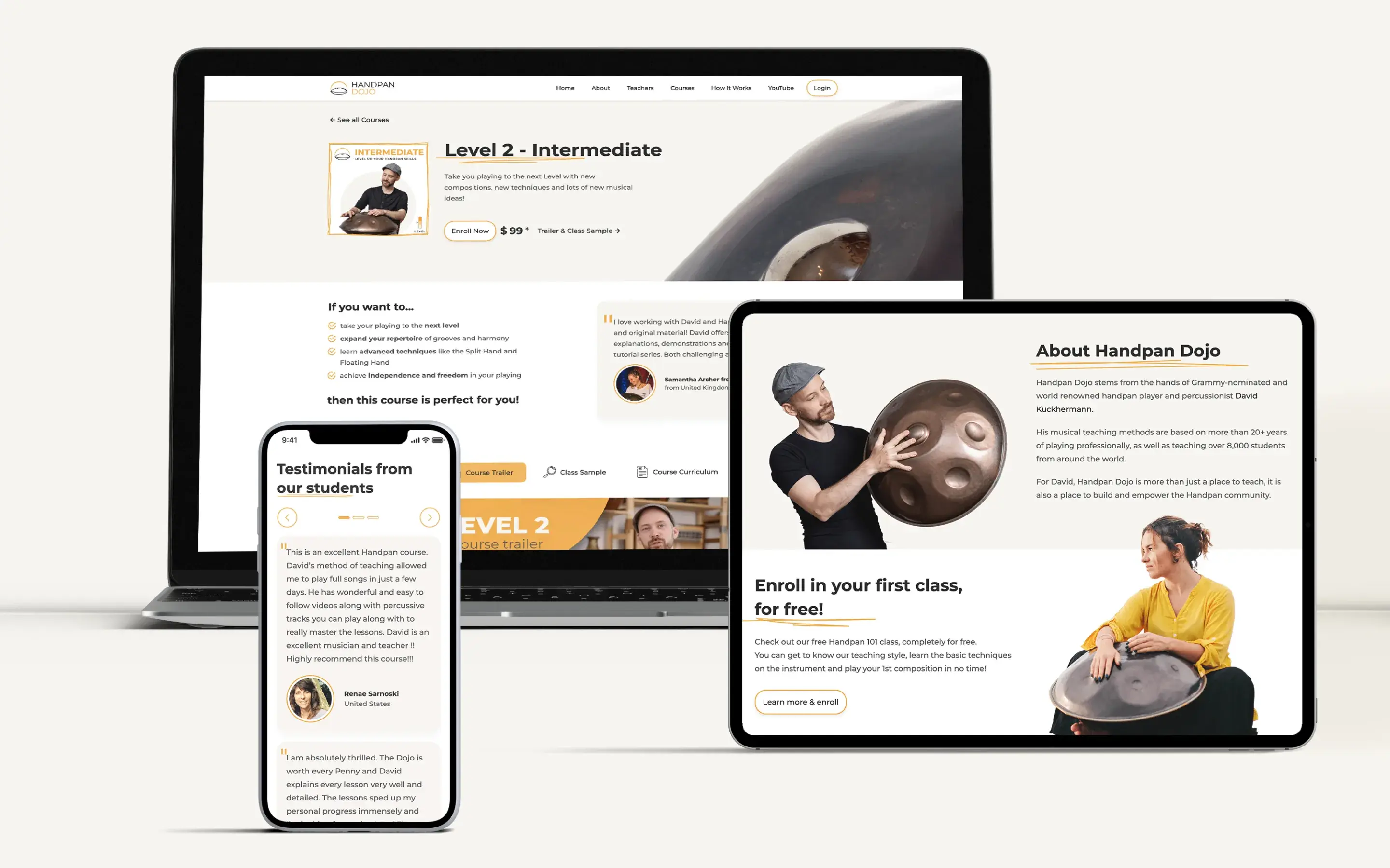
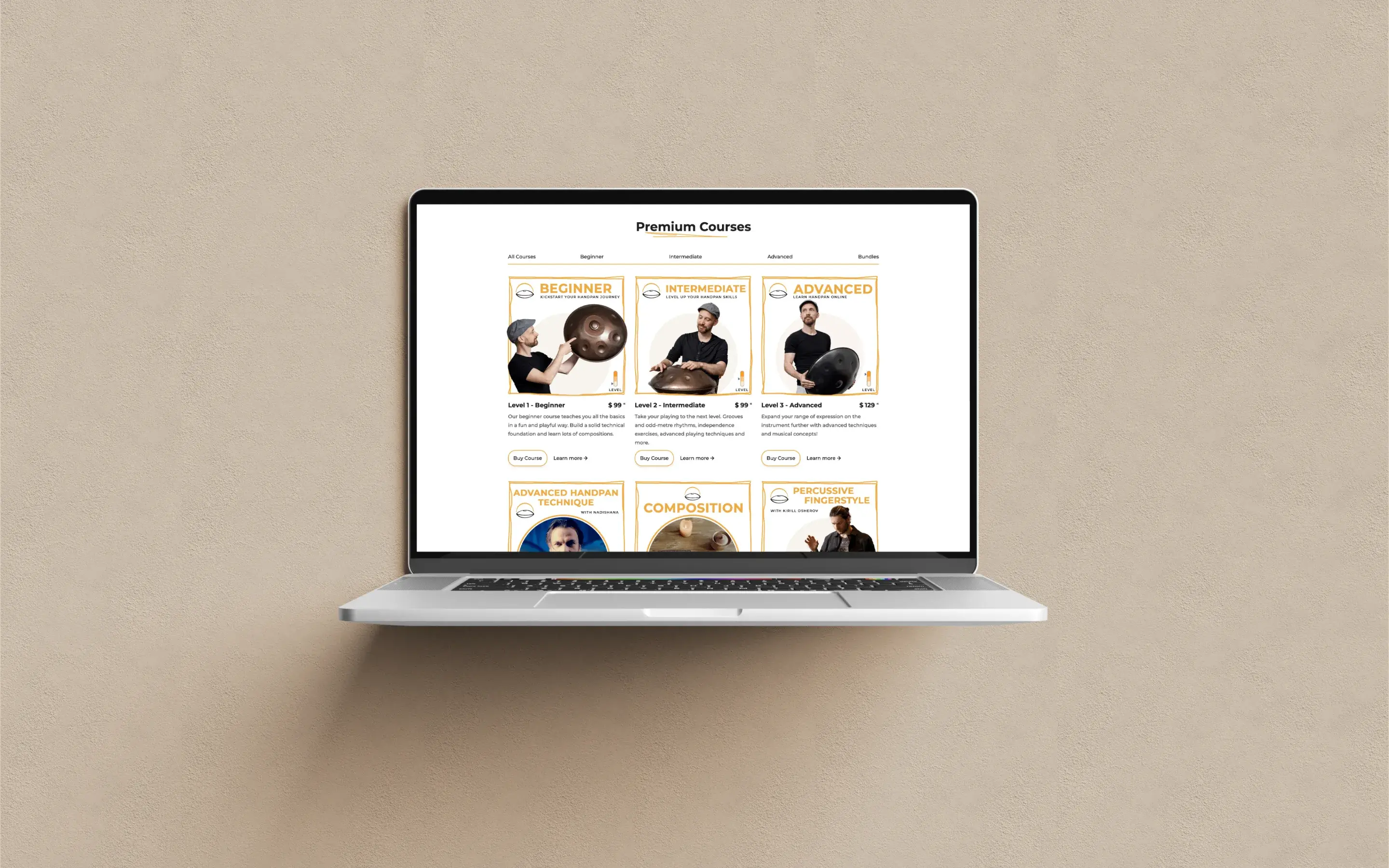
A new logo, a full brand identity, and a website redesign built around one requirement: that the person teaching should feel knowable before the first lesson, and the instrument should feel intriguing before the first note.
So the identity carries David's actual personality rather than a professional impression of it: warmth, and the openness of somebody who wants you to have a go. Everything is built to put the visitor inside the thing rather than in front of it. The word dojo was already in the name, and it turned out to be the honest one: not a stage with an audience, a room you are in.
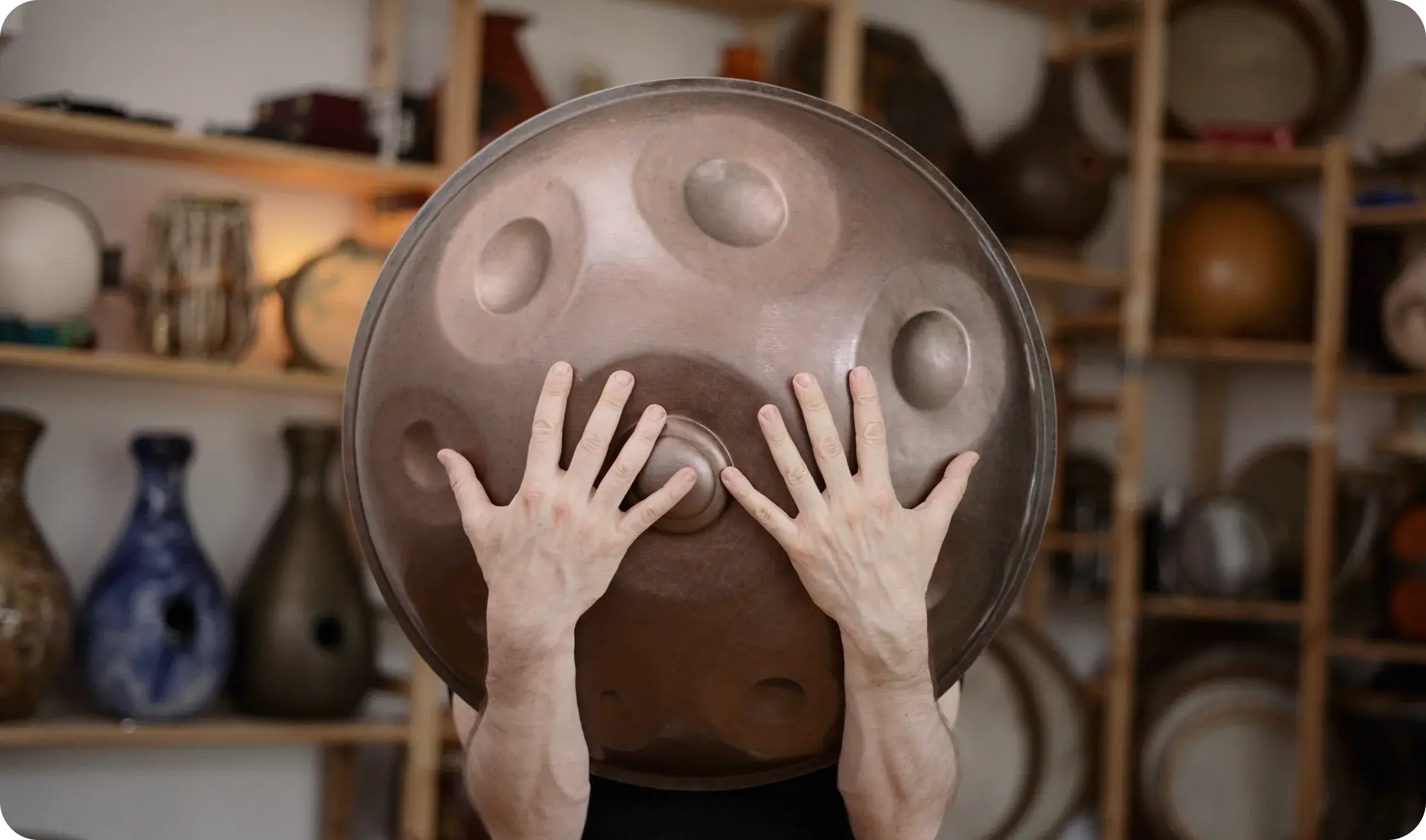
The instrument is treated as the draw, not the obstacle. Someone arriving with no idea what a handpan is should want to find out, which is a brand problem long before it is a marketing one.
The result
The online courses took off.
The brand now brings in a wider audience, and a different kind of visitor: people who arrive already interested in learning, and already trusting the person who will be teaching them. That second half is what shortens everything that follows.
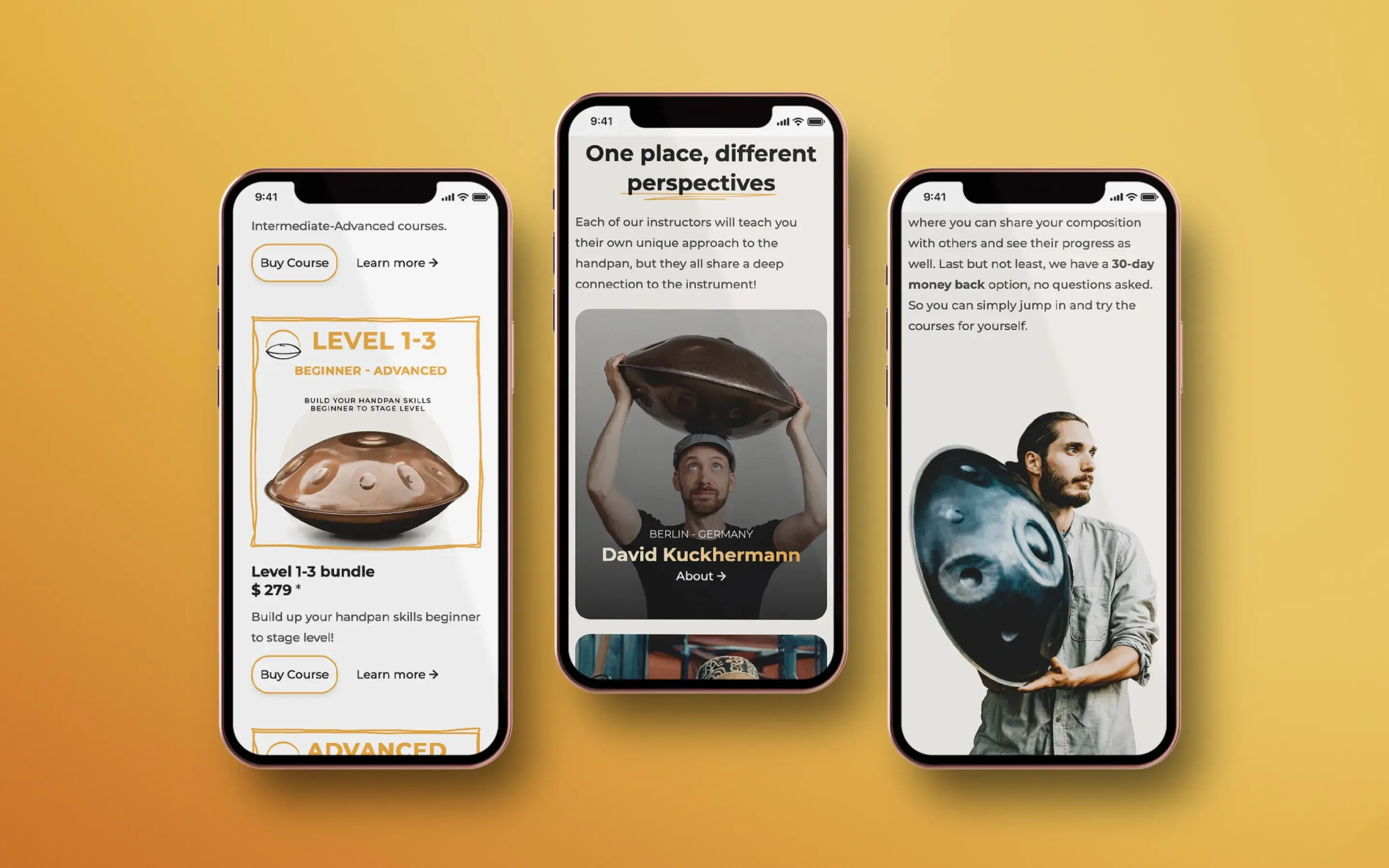
Handpan Dojo today teaches more than 38,000 students and runs more than a hundred free lessons as the way in. It is no longer one musician's teaching page: seven teachers now teach on it, each with their own approach to the instrument.
That last part is the quiet proof. A personal brand cannot hold six other world-class musicians without shrinking them. A school can. The brand was built roomy enough that the business could become something bigger than the person it started with, which was never in the brief, and is the best thing on this page.
And the competition stopped competing. The largest competitor merged rather than continue against it. David has since returned to the studio for his next venture.
The deliverables
- Brand development
- Creative direction
- Logo redesign
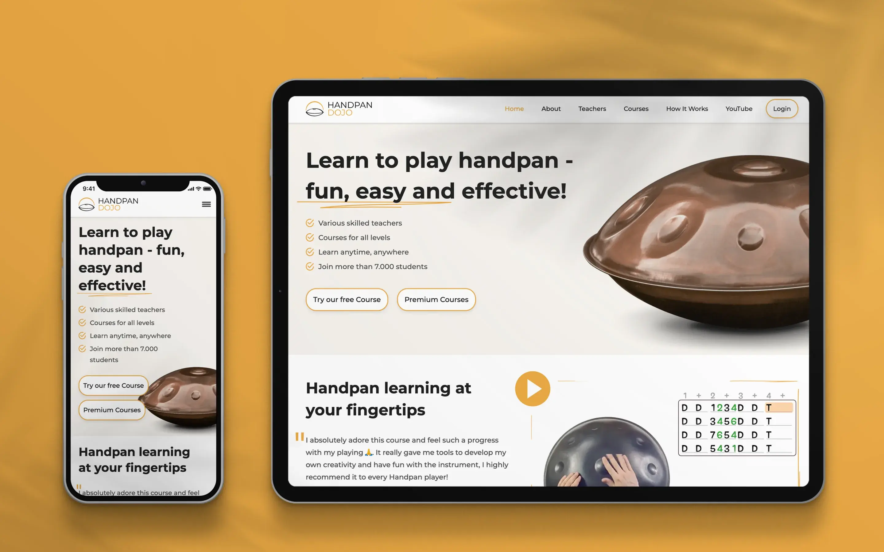
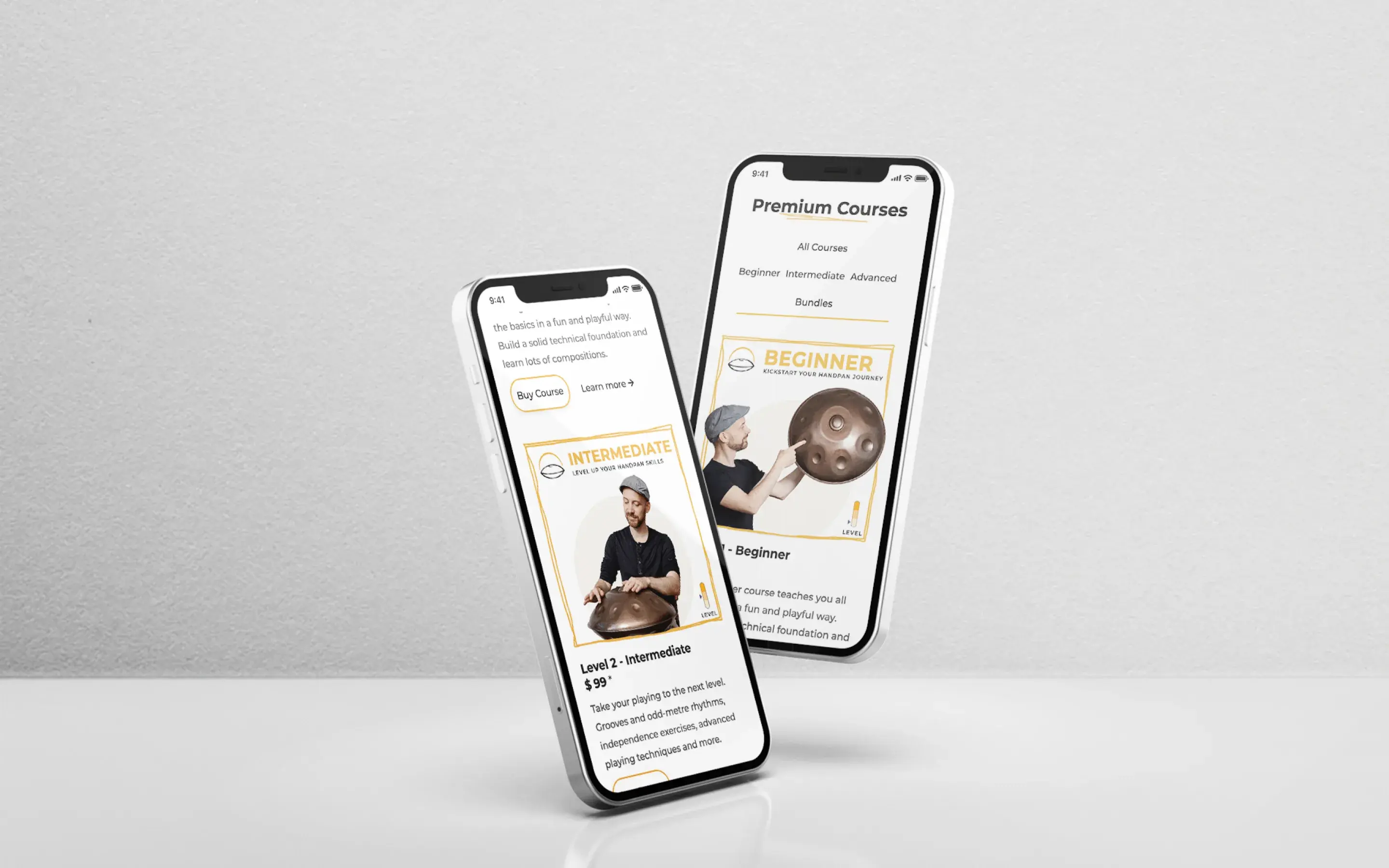
- Website redesign
- UI & UX design
“Working with Andjela and Vanja was a real pleasure. Excellent communication, a lot of persistence until everything was perfect and I'm very happy with the results.”